Saturday, 9 May 2015

Sign Off

Hello Moderator,


Below you will find all of my Research and Planning posts, Evaluation Questions 1-7 and my finished Music Magazine. I have designed my blog so it is easy to navigate and easy to read, so I hope you enjoy scrolling through my blog!

Many Thanks, 
Stephanie.

Completed Music Magazine

Here is the finished product!


Extra Audience Feedback: Complete

I sent out images of my completed Front Cover, Contents Page and Double Page Spread to a few of my friends, and got some last feedback from them.


Facebook-Megan


Whatsapp-Ellie
Front cover

 Contents Page

Double Page Spread


Evaluation Question 7

Here are my two videos to show how my preliminary task compares to my finished music magazine. In the first video I have compared my front covers, and in the second video I compared my contents pages.
In case the audio isn't clear I will post an overview of what I have said below the video.


When I created my college magazine I had never used photoshop before so I knew how to use the basics of the software which is why the front cover looks very minimal compared to my music magazine. 

Obviously the genre of the two magazines is very different so the look of the magazine is bound to be different, you'd expect a college magazine to be more widely appealing and a punk/alternative magazine to have a more edgy feel.

As you can see the simple layout hasn't really changed but I have used it more effectively with my music magazine. There is a lot of black blank space on my college magazine whereas my music magazine is packed full of information and images. 
My photography has also improved dramatically between the two covers. A lot of shadows fall on Adams face in my college magazine making the image not as clear whereas I found a spot to take photographs in clear daylight for my music magazine overall making the image clearer, and my editing skills were put to the test here, as I smoothed out parts of josh's skin using the spot healing tool, but not too much so he looked fake, and I also adjusted the brightness and contrast of the image to work accordingly. The other photos along the bottom of my cover show that I did take a lot of photos to find the right shots, I have 3 extra models and one has a nature themed background, and the two are made to look like they have stood in front of a coloured backdrop, however I just cut out the original backgrounds and created a drop shadow. The other photo is one of my own photos from a gig that I went to this varies the use of technology since I used my phone for this photo and makes my cover look different and more appealing.

I kept one font for my college magazine making the cover look really boring and plain, but I changed this for my music magazine, I downloaded my own font and used that as a unique font for my masthead and I also downloaded another separate font to the rest for my bring me the horizon cover line, the font is quite similar to their band logo. For the rest of the magazine I used a sharp, bold font that is easy to read so I used the Impact font.


The layout is completely different, I had an idea for my college magazine that with my limited skill and knowledge at the time I was unable to carry out successfully. However after doing research into my genre of music magazine the layout became more clean cut and a lot simpler than what I had planned for my college magazine. Both contents pages have a white background but again excessive amounts of space was an issue in my college magazine. My music contents page however has filled the space without looking too crowded. And the amount of writing is split with images making the whole page easier to read and looks like it has a clear section by section guide line. 

Imagery was also a massive difference. My college magazine has one image off the Internet to relate to a mine craft related cover line, but that is it none of my own photos. My music magazine on the other hand uses all of my own photos, again varying the use of technology I used my phone for 4 out of the 5 pictures, and again two of these photos were from gigs corresponding with cover lines I had chosen. 
My colour scheme ties in well with the front cover making the two pages look related and definitely belong to the same magazine, whereas my college magazine since it was unfinished could have belonged anywhere. 

Again I used the same font throughout my college contents page showing no creativity or experimentation, but on my music magazine I continued the font scheme through from the front cover to the contents page again tying in nicely as a magazine on a whole. 
My contents page uses a lot of different features since I have added red rectangles to section off the page, and added black rectangles to section off different features in the magazine. My photographed features also have their own red triangles to promote that feature more with the page number inside as an easy guide. 

Overall i know that my music magazine was much more of a success than my college magazine. My photoshop skills have developed massively over the course of the first year allowing me to experiment more meaning my music magazine could have it's own uniqueness and not having to adjust to my own limitations.

Tuesday, 5 May 2015

Evaluation Question 6

Throughout the production of my musiz magazine I have used and developed my skills in numerous different technologies.


The first bit of technology I used was the Canon 1000D DSLR camera to take the photographs of my various models. This peice of technology was completley new to me, so I had to learn how to use all the different settings available on this model of camera, this took quite a bit of getting used to but all in all the photos I took were a complete success. To begin with I took a few photos with my phone but these photos were badly lit, and quite blurred compared to the photos taken with this camera, so the camera was a nessecity for my model photos.


A very handy piece of technology that I used throughout the production of my magazine which I took full avdantage of was my phone (Samsung galaxy s5). I used my phone to message my friends to organise times of when to take photos, and to gain feedback. I used facebook and whatsapp to gain my social networking feedback, I took screenshots on my phone of these comments and continued to post them to my blog.


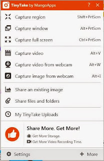
To record the software I have been using I have used Ishowu when demonstrating Adobe Photoshop, and for recording software that I used at home I used TinyTake by MangoApps to record voicethreads and videos. Both these pieces of software were completely new to me, I didn't know that software like this was so easy to use, it also provides another way to record evidence during the production stages.  

The video below shows a little tutorial of how I have used Adobe Photoshop as another piece of technology. I filmed the video using Ishowu and the voiceover using TinyTake. 
In case the audio quality isn't fantastic here is an overview:
I decided to create a simple masthead and manipulate one of my photographs of my model Josh.
For the masthead I created a text layer and chose the font and then changed colour by using the colour picker tool. I then added a black box behind my mastehad, by drawing a rectangle using the shape tool and then using the paint bucket to change colour.
When manipulating my picture of Josh I showed how to adjust the brightness/contrast, the hue/saturation and the levels of the photo to add various filters and to enhance the photo. I then showed how to smooth out a skin tone by using the spot healing tool across Joshs jawline.

Other peices of technology I have used are Flickr, Prezi, Slideshare and Blogger.
Flickr was a new platform for me to produce question three of the evaluation regarding distribution. Flickr can be used as an alternative to regular powerpoint presentations to show and present my work in a more creative way.
Prezi is something I have been familiar with for a long time now, and I prefer Prezi to Powerpoint because it is more interactive and is really easy to present your ideas.
Below I have added a short video of how to use the basics of Prezi and how Prezi can improve an average presentation.


I had never come across Slideshare before, but I have learnt that Slideshare is a way to post your own powerpoints for public viewing, which could give a lot of extra feedback.

And finally Blogger, I had never used Blogger before AS Media the closest I have ever had to a blog is a Tumblr blog, but Blogger is completely different. I really like using Blogger and how simple it is to use to post your progress online for everyone to see, again it has a comment feature which encourages feedback. I have learnt how to embed links into blogger which was a nessecary part of a few of my other evaluation questions.


Friday, 1 May 2015

Evaluation Question 5

Evaluation
Question 5: How did you attract/address your audience?

Below is a link to my annotated presentation using a Prezi format.


Thursday, 23 April 2015

Evaluation Question 4

This is one example of my younger target audience for my music magazine.
A teenager with a punk inspired mise en scene is likely to buy my magazine since the artists mentioned are part of their music taste.


The mise en scene of the models inside my magazine is very similar to the actual audience meaning the magazine will be more relatable and will inspire them to maybe go into a punk/rock music career.
My genre of magazine would make more sense and would be more intriguing than a pop magazine purely because of their individual music taste which I have portrayed on my front cover.

Friday, 17 April 2015

Evaluation Question 3


Clicking on the link above will take you to my Flickr where I have annotated my front cover, contents and double page spread regarding distribution.

Thursday, 16 April 2015

Evaluation Question 2


I have taken a screenshot of my main model used on my front cover and double page spread feature, and compared this with a photograph of Sid Vicious (John Ritchie) from the Sex Pistols.
My double page spread feature was based on this era of music along with the punk genre. I took a lot of inspiration from the sex pistols such as their logo, the colour scheme and their mise en scene.
Firstly I changed my image to black and white to work with the punk style, and added pink to continue the well mown colour scheme. The photos of my model were take against a brick wall to show a slightly urban atmosphere, this can also be compared to the photograph of Sid Vicious because of the punk/urban background.
Sid Vicious has dark messy/spiky hair, a motif style ts-hirt and a leather jacket on in the photograph, so I tried to mimic that by making my model wear a leather jacket, a guns n' roses ts-hirt and also styled his hair very messily. For my magazine however I decided to use a younger artist than an older artist in order to appeal to my audience better.

Construction of my image
I originally took a mid shot of my model which was similar to the photograph of Sid Vicious, however to work in the style of a Kerrang! magazine I enlarged the image slightly to cover the full A4 side of the double page spread. My model is stood quite straight and awkwardly unlike the photograph of Sid Vicious, because my model is a lot younger and in-experienced I wanted that to emphasise his "innocence" and this would also appeal to my younger target market as they could relate to him. I used natural lighting to take my photographs to produce a clearer image as the photographer would have done when taking the photo of Sid Vicious. My models expression also shows his slight "innocence" because he is partially smiling, which shows he is care free like the other artists in the punk genre.

Wednesday, 15 April 2015

Evaluation Question 1


Evaluation
Question 1: In what ways does your magazine use, develop and challenge form and conventions of real media products?

Below is a link to my Powerpoint uploaded onto Slideshare


Monday, 13 April 2015

Music Magazine Update: Front Cover 13/04/15


I made some final changes to my front cover to achieve the punk/rock look, I made the text pop out more by adding alternate drop shadow colours. I also moved the pull out quote to cover my models neck/chest and enlarged the text and quotation marks again adding the drop shadow.

Friday, 27 March 2015

Music Magazine Update: Front cover 27/03/15


These two photos originally had the same brick background as the main front cover image, so in order to show a change, I replaced the brick background with a black background with an element of colour to look more like a photo studio. I chose red and pink to reflect the colour scheme of my magazine. The dark shadow also makes the photo look more 3D than having a flat black surface.

Thursday, 26 March 2015

Music Magazine Update: Double Page Spread 26/03/15


The last element I needed to add to my double page spread was the pull-out quote which I decided on my previous post. The quotation marks are larger than the font and I decreased the opacity so that the quote to stand out on top. The white font on it's own wasn't enough, so I firstly added a black outline but the text looked too flat against the image, so I added a drop shadow and firstly used a pink drop shadow but it was too much since the colour fades from pink to black and white (left to right), the pink didn't flow, so I chose to add a dark grey drop shadow so it wasn't too harsh, this also softened the edges of the text and made it stand out more against the image of Josh.

Research and Planning: Pull out quotes


Across my double page spread I needed to add a pull out quote from the interview. A pull out quote will be a personal reply from the artist in question, or a point the artist has made but changed to fit the context of a quote and for it to make sense.


My pull out quote options from my interview with Josh are:

"Without a doubt I'd go on tour with Slash, he's a living legend!"

"We've all matured recently (pfft) and thought it would be a good idea."

"It would be awesome to hang out with Blink for a while, such a milestone in my life."

I have decided to choose my first option, since it shows one of his influences and also discretely addresses one of the questions in the magazine, possibly making a customer to read the interview at length.


Friday, 20 March 2015

Music Magazine Update: Double Page Spread 20/03/15


I have finished my double page story, all I need to do now is add a pull out quote across Josh's body and then my double page spread is complete.

Friday, 6 March 2015

Music Magazine Update: Double Page Spread 6/03/15


This lesson I have written lot more of my double page spread and continued the pink and black text throughout the interview. I have also used a larger font size for the beginning letter as most other magazines do, to draw attention to the actual story. I have also used more language that my model/artist would have used and included a slight bit of swearing so far, this has been asterisked out so not to be seen as explicit. 

Tuesday, 17 February 2015

Music Magazine Update: Double Page Spread 17/02/15

I have made some very noticeable changes to my double page spread. The brick wall contrasted the pink too much and looked quite flat against the white interview box. The black and white filter looked a lot better compared to the original colour. I then adjusted the contrast to make the black of my models leather jacket stand out. The pink from the Guns n' Roses t-shirt stands out against the black and white and continues the punk theme. I used a pink gradient to continue the 3 colour, colour scheme. I also added my first question and continued the pink colour scheme through the question part of the double page spread. I have finally also added some grey transparent quotation marks to add a memorable quote between them across the models body.

Friday, 13 February 2015

Music Magazine Update: Double Page Spread 13/02/15


Since my last update I have typed out my intended introduction for the time being I used a sans serif, but I will be using the Constantia font which is a serif font and often used for magazines. I have also added a subtitle carrying on the sweet theme of the text. Now that I have started to use pink text I think it flashes too much against the bright red brick background so I do intend to change that next time. I have added small page numbers at the bottom corners of the page also in the same serif font. 

Friday, 6 February 2015

Research and Planning: Double Page Spread Story

I have looked at the Fresh Blood section in kerrang! To compare with my double page spread.
My spread is a new introducing artist which is why the section is called Freshers implying new bands/artists and that they are young. 

My band in my double page spread are called Honey and I am representing them as a punk/alternative band. 

"These punk teens are making the country sweeter by the minute"

This is my idea for an introduction to my double page story.

"The honey jar is starting to be filled this week as the Manchester five piece are about to start a small scale Uk tour. The group have been welcomed greatly into the Reckless office this week, so I took full advantage and took some time out with the bands lead guitarist Josh Swindells to talk touring, influences and future endeavours."


Sunday, 1 February 2015

Research and Planning: Other models hair and makeup

 Since my magazine is covering punk and alternative genres I knew I had to cover both styles. I wanted Megan to wear alternative style clothing and we achieved this by making her wear a camouflage jacket. Not many people wear camouflage as a fashion statement. 

Becca is representing both genres through her mise en scene. Becca has red dyed hair and wears thick black eyeliner which is common amongst the punk and alternative genre. She is also wearing a leather jacket which represents the punk genre.

James is representing the alternative genre, James is wearing a smart shirt and jumper combination with red braces. James has a mod look about him which is classed under the alternative genre. 
James also can emphasise the mod look with his long trench type coat which has seen badges on the front. The cigarette also adds to this mod mise en scene


Research and Planning: Main Model hair and makeup

For a punk look I wanted the main feature to be the models hair. 
Josh has purple/brown hair which fitted in with punk hair looks. Me and josh created a very messy, spiky, windswept look by using a lot of hair spray. Josh's hair is already layered which gave a rough texture. 


Friday, 23 January 2015

Music Magazine Update: Double Page Spread 23/01/15


I added the sticker in the top right corner that I mentioned in a previous post and continued the pink/purple colour used in my models t-shirt. I added a transparent copy of the title last lesson but this week I made it stand out more and added the quotation marks. I have also added page numbers in the bottom corners.

Thursday, 22 January 2015

Research and Planning: music magazine stickers

ROCK SOUND INTERVIEW
 ROCK SOUND NEW MUSIC
KERRANG! NEW ARTIST
KERRANG! GIG REVIEWS
KERRANG! HEADLINES


ARTIST DOUBLE PAGE SPREAD SECTIONS IN KERRANG!


NEW FAVOURITES FROM NME MAGAZINE


For my magazine I think I am going to include a section in the corner of the page with the text "FRESHERS-HONEY" 
Freshers applying to a younger demographic but also meaning something new and exciting. Followed my the band name HONEY. 

Research and Planning: Double page Spread further inspiration

For my further research into designing my double page spread I have looked at different Kerrang! Issues.


This issue shows the title spread across the double page which I have chosen to do with my own magazine, but with my own twist. My spread is punk inspired so I have designed my title onto black obscure rectangles with white text against a brick background. This design also reminded me of The Sex Pistols logo 

This next issue also contributed to the black box rectangles and the layout of my double page spread. This issue also includes a sticker at the top left which has made me want the research into more stickers in different magazines.


This last double page spread includes an image spanning the whole spread which inspired me to keep the brick background running through the whole of my page. The brick background also helps to show an urban style and punk genre. Also the red tones in the image are continued in some text which is what I am going to do with some of my text. I am going to take the pink colour from my models shirt and use that as a boarder colour and subtitle colour.


Music Magazine Update:Double Page Spread 22/01/15


I have started my double page spread today. I chose to continue the brick background theme to relate to the front cover. I continued the bar at the top of the pages but instead of using red I mimicked the pink colour from Josh's t-shirt. I created a black title to represent a punk theme, and used quotation marks to tie into the main story. My interview will go in the white box which I surrounded with a grey boarder to make it look less harsh against the brick background. My introducing line with go in the black rectangle to stand out.

Sunday, 11 January 2015

Research and Planning: Model release forms

 
JOSH SWINDELLS
FRONT COVER, CONTENTS PAGE, DOUBLE PAGE SPREAD FEATURE

REBECCA FENNA
FRONT COVER FEATURE
JAMES GWYNNE
FRONT COVER FEATURE
MEGAN LEWIN 
FRONT COVER FEATURE

I haven't asked for personal addresses for safety issues.


Monday, 5 January 2015

Research and Planning: Front Cover and Contents Page.


This is what my music magazine is looking like at the moment. I am really happy with the outcome so far. My photoshop skills have developed a lot since I started the course and have really come in hnady when creating the two pages.