In order to keep up to date with new posts and tasks related to separate stages of my magazine i filled in this production schedule to keep me on target.
Thursday, 23 October 2014
Wednesday, 22 October 2014
Research and Planning: Equipment and software list
As well as creating a list for costume and props I have created a short list for the equipment and software I will need during the making of my music magazine.
Equipment:
MAC computer- photoshop, indesign
Camera- test shots, final shots for front cover, contents and double page spread
A model
Software:
Adobe Photoshop- editting photos and magazine cover
Indesign- cotents and double page spread
Equipment:
MAC computer- photoshop, indesign
Camera- test shots, final shots for front cover, contents and double page spread
A model
Software:
Adobe Photoshop- editting photos and magazine cover
Indesign- cotents and double page spread
Monday, 20 October 2014
Research and Planning: Costume and Props list
After having a think about what to include on my magazine front cover I decided on this list:
Costume:
Costume:
- Dark casual clothing e.g. black skinny jeans
- Red converse/Black boots
- Leather Jacket
- Dark sunglasses
Props:
- Guitar
- Sunglasses (could be used as a prop)
- Mobile Phone (young target audience)
Research and Planning: Costume and Props research
For my front cover image I wanted to portray the alternative rock/punk genre through the models outfit and background.
Here are some images of artists who would be featured in my genre of magazine.
Here are some images of artists who would be featured in my genre of magazine.
These four images show artists who have been featured on the covers of Kerrang! and Rock Sound. These images I have found represent their clothing well, these artists wear mainly dark clothing which is an element I will include on my cover. The clothing they wear is quite casual but looks quite smart with two artists wearing leather jackets. Their hair is styled messily which gives a rugged look about them and promotes the rockstar lifestyle.
For research into props I collected these three magazine covers, showing artists holding different props. The first issue shows Andy Biersack holding a microphone to show that he is a performer and the lead in a band. The first issue is a commemorative issue and he is featured on the cover because he is performing this is also why the microphone was included in the photo shoot. The second issue shows Billie Joe Armstrong performing on Green Day's U.S tour, the guitar was a necessary edition to show that he is a true performer. The final issue shows Oli Sykes featuring on a special edition of Kerrang! which shows pictures from the year of 2012 so to tie into the title the camera is used as a prop.
Sunday, 19 October 2014
Research and Planning: Music Magazine Drafts
FRONT COVER:
For my draft I wanted to include an eye-catching title covering the top of the front cover using the font from a previous post (Zilipeppo). I included the price in the top right corner and a barcode in the bottom right. My main image will be a mid shot of 1 model and it will cover the whole background of the magazine and the cover lines will surround the image and two strips will be created at the top and bottom of the magazine for 2 more cover lines (general cover lines e.g. touring info/posters). I have decided the main cover line will be in bigger text to make it stand out as the main feature of the magazine.
For my draft I wanted to include an eye-catching title covering the top of the front cover using the font from a previous post (Zilipeppo). I included the price in the top right corner and a barcode in the bottom right. My main image will be a mid shot of 1 model and it will cover the whole background of the magazine and the cover lines will surround the image and two strips will be created at the top and bottom of the magazine for 2 more cover lines (general cover lines e.g. touring info/posters). I have decided the main cover line will be in bigger text to make it stand out as the main feature of the magazine.
CONTENTS PAGE:
For my contents page I wanted to fill all the space since you never get a magazine including a few stories and having a blank white space. So I decided to use a big simple text along the top of the page for the contents title. This will then be followed by a grid of around 9 cover lines including the main story. In the middle of the page I'm going to include three images one relating to the main story, and two relating to other stories inside the magazine. Underneath these images I will include a couple more weekly articles relating to tour dates, posters, gig reviews, advice columns, and new music charts.
DOUBLE PAGE SPREAD:
My double page spread will consist of a written interview with one member of a new band. At the top and bottom of the page will be a border line with "RECKLESS" in small print in each corner. At the top left will be the main title and strap line and underneath that will introduce the new band and the person I will be interviewing. The interview will be set out in two strip columns down each side of the page with a white background. Across the page fold will be a big image of the band member I will be interviewing and this image will portray the bands appearance and genre. Aswell as the main image I will include to smaller images (scrapbook feature) showing the band and another image of the band member. After the interview has finished I will include some promotion i.e. where to find them, upcoming gigs and future plans.
My double page spread will consist of a written interview with one member of a new band. At the top and bottom of the page will be a border line with "RECKLESS" in small print in each corner. At the top left will be the main title and strap line and underneath that will introduce the new band and the person I will be interviewing. The interview will be set out in two strip columns down each side of the page with a white background. Across the page fold will be a big image of the band member I will be interviewing and this image will portray the bands appearance and genre. Aswell as the main image I will include to smaller images (scrapbook feature) showing the band and another image of the band member. After the interview has finished I will include some promotion i.e. where to find them, upcoming gigs and future plans.
Thursday, 16 October 2014
Research and Planning: Target Audience videos (music magazine)
These are the questions i asked in my target audience interviews.
1. What cover lines/stories would you like to read about in an alternative rock/punk magazine?
2. Should the model on the front cover of my magazine be male or female and what clothes should they wear?
3. What extra features would you like to see in my genre of magazine? (e.g. posters, discounts, competitions)
4. What questions would you like me to ask in my interview with a new artist?
5. Are there any current artists/bands you would like me to feature in my magazine?
1. New songs being released, stories about the artist themselves.
2. Male, black leather jacket, white top, jeans.
3. Posters, tour info, competitions.
4. What inspired them to go into the music industry.
5. Mallory Knox, You me at six, All time low.
Shafia
1. New music that has been released.
2. Male, wearing black.
3. Posters and competitions.
4. What inspired them.
5. All time low and Green Day.
Aisha
1. Things about the artist themselves.
2. Male, white/red tshirts with a statement, boots, black leather jacket.
3. Posters!
4. Questions about them as a person.
5. The pretty reckless, All time low, You me at six.
Rebecca
1. New songs being released, stories about the artist themselves.
2. Male, black leather jacket, white top, jeans.
3. Posters, tour info, competitions.
4. What inspired them to go into the music industry.
5. Mallory Knox, You me at six, All time low.
Shafia
2. Male, wearing black.
3. Posters and competitions.
4. What inspired them.
5. All time low and Green Day.
Aisha
1. Things about the artist themselves.
2. Male, white/red tshirts with a statement, boots, black leather jacket.
3. Posters!
4. Questions about them as a person.
5. The pretty reckless, All time low, You me at six.
Research and Analysis: Music magazine questionnaire analysis
I sent out my questionnaire to 10 people via email who haven't done media studies before so I wouldn't get a biased opinion. I also explained shot types to the various recipients before they replied.
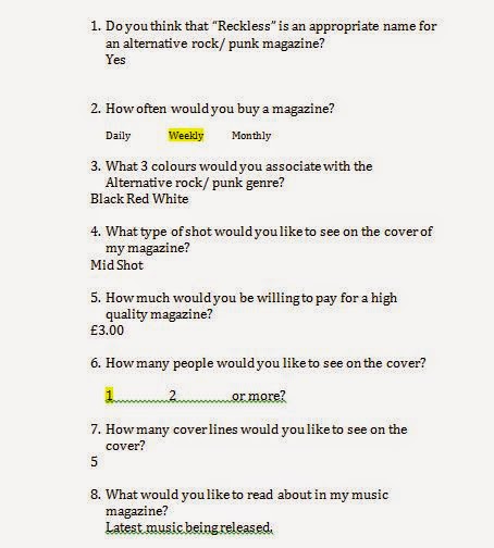
This is one example of a completed questionnaire:
After analysing all my questionnaire results I noticed that everyone liked the name Reckless for my magazine. 7 out of 10 people said they would buy magazines weekly.
The third question was open to opinion and the three reoccuring colours were Black, White and Red.
After explaining shot types the two main shot types that showed up were Mid shot and Medium Closer up but more people decided a mid shot would be better suited to my magazine.
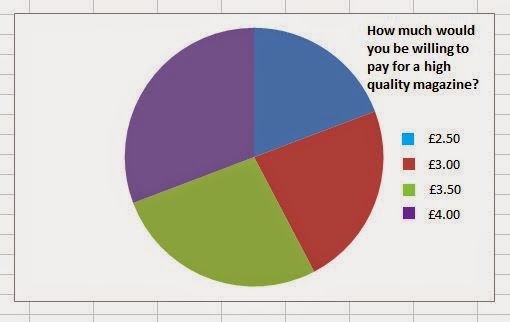
Question 5 again was open up to opinion but after collecting my results 5 people said they would be willing to pay £3.00 for a magazine and 3 people said they would be willing to pay £3.50 so my magazine price should lie between these two amounts. My front cover should contain just one model since 7 out of 10 people said that only 1 person should appear on the cover.
For question 7 i got mixed opinions:
2 people said 4 cover lines
2 people said 5
4 peoplesaid 6
2 people said 7....so for my magazine I am going to include 6 cover lines and a main story.
For the final question again it was open to opinion and 5 ideas popped up.
8 people thought including the latest music would be a good idea. 3 people responded saying that interviews with artists would be interesting. 4 people thought that articles on new artists would be a good feature. and the two other ideas were gossip sections and an advice column. I am going to consider all these ideas and definitley include the first three ideas since they are the most popular and will intrigue readers more.
Here are my results collected into pie charts
Here are my results collected into pie charts
Research and Planning: Music Magazine Questionnaire
To help me out with my front cover and contents page for my music magazine i sent out this questionnaire to 10 people in order to get some feedback.


1. Do you think that "Reckless" is an appropriate name for an alternative rock/punk magazine?
2. How often would you buy a magazine?
Daily Weekly Monthly
3. What three colours would you associate with the Alternative rock/punk genre?
4. What type of shot would you like to see on the cover of my magazine?
5. How much would you be willing to pay for a high quality magazine?
6. How many people would you like to see on the cover?
1 2 or more
7. How many cover lines would you like to see on the cover?
8. What would you like to read about in my music magazine?
Monday, 13 October 2014
Research and Planning: Target Audience Presentation
Research and planning: Shot type research
Monday, 6 October 2014
Research and Planning: Social Media Masthead Feedback
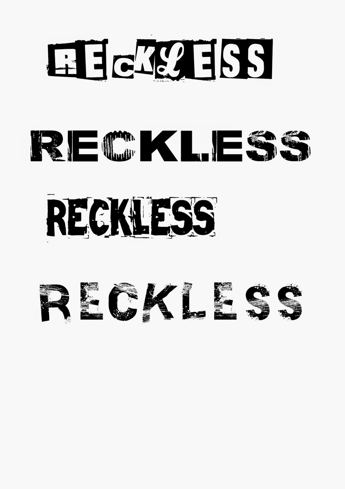
I asked a few of my friends on Facebook to give me their feedback on my four ideas for masthead fonts.
My question: Hey, for my media course at college I need some feedback on masthead fonts for my own music magazine, the different fonts are attached please could you tell me which you don't like and do like and give me a reason why.
This is my feedback:
From this feedback I have noticed that the first one is not very popular because of the oddly sized letters and different fonts within one font. On the other hand the 2nd and 3rd mastheads are quite popular, but in order to come to a conclusion I have decided on the second font since it is liked by both genders so would appeal to more people within my target audience.
Research and Planning: Masthead fonts for my music magazine
I chose these fonts from www.dafont.com
These fonts all have an edgy look about them which is why i thought they would be suitable for an alternative rock/punk magazine, but in their own way all have a unique feature about them. The first font is quite different and involves different lettering, the second is easy to read yet has a grunge feel to it, the third is quite sharp and concise and fourth is very spaced out and very edgy.
Friday, 3 October 2014
Research and Planning: Music Magazine Masthead Ideas
The main component for my music magazine is the masthead. I started to brain storm a few ideas relating to music genres and personal qualities related to stereotypes found in punk/rock magazines.
The words in bold:
Rebel
Reckless
Hype
Electric
Blink
These five words stood out for me and could make potential mastheads.
I did some research into these potential names to see if these magazines already existed unfortunately Rebel, Hype and Blink are already real magazines relating to music.
So for my magazine i am going to use Reckless since it relates to the stereotype of teenagers and is a sharp quick, two syllable word.
Subscribe to:
Comments (Atom)


